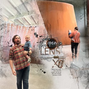
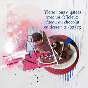
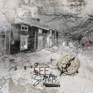
I had two photos I wanted to use for this layout, and I also wanted an easy/quick design that was as spacious as the Richard Serra sculpture installation my grandson was experiencing during his first museum visit. My solution was to cobble together a single-page layout using both of the templates from a two-page spread in the Scenic Template Album set (pages 6 and 7). I pushed the Fotoblendz (one from each page) onto a single page, dragged over some of the textural elements and a lot of the spatters, then placed the photos, word cluster, a slightly deconstructed multimedia element, and blue stains, and that was basically that. The background is Artsy Paper No 4. The entire Urbicolous Collection is on deep-discount sale through September 22, here: [URL]
https://www.oscraps.com/shop/ArtPlay-Urbicolous-Collection.html[/URL]

