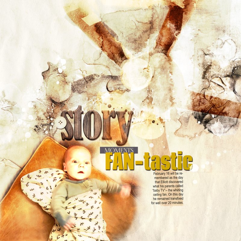
I had a photo of a ceiling fan and another (blurry) one of a baby mesmerized by the fan. I got it into my head that the photos should work together with some sort of perspective. But while I saw it so clearly in my head, getting it to happen was another thing altogether. Superimposing the two extractions in a way that roughly approximated my concept took a lot longer than I care to admit. Finding a background Artsy Paper that would work with the color/extractions AND disguise the flaws also took forever. I finally decided on an artsy paper from the Bravura APP, and then used a couple of Bravura Artsy Transfers to jazz things up but mostly to obscure glitches in the fan blades AND, in fact, to even add a fan blade that wasn't in the photo. That was pretty cool. Things got a little intense, though, so I lightened up the layout after flattening the file with a gold gradient at reduced opacity on color dodge blend mode.

