Oscraps
- Credits list
- On Sale from ... September 21 for 2 weeks
AnnaRelease 31 March 2017
Artplay Palette Hygge (papers, foliage, transfers, overlays)
Artsy Transfers Hygge
MultiMedia Hygge 1
Hygge WordART Mix 1
Other
Artplay Palette Sea Life (pattern paper, desaturated)
Artplay Palette He (button recolored)
Artplay Palette Strom (crown button)
Artplay Palette Whizzo (black flower)
MultiMedia Magic Sprinklez 1 (beads)
Find My Way 1 (compass)
Clouds 1
KrissKross Stitched Overlays 1
Urban Threadz 2
Urban Stitchez 14
Urban Threadz 20
Urban Stitchez Arrow 1
FotoBlendz Overlays 11
12x12 Page Fotoblendz 10
Process
This was a 2 part process ...
Part 1
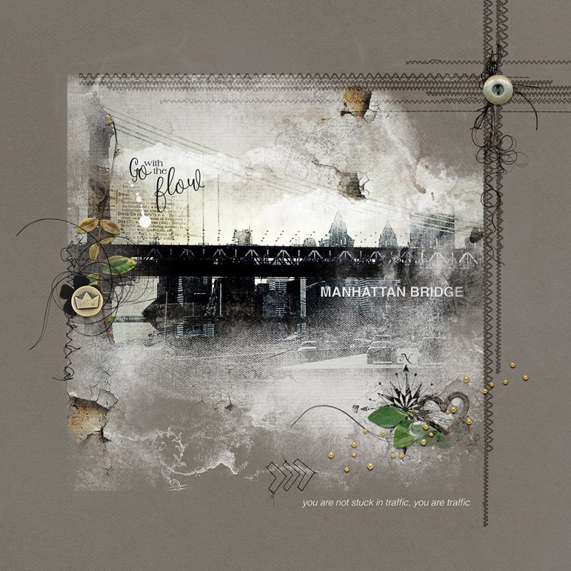
A solid paper from APP Hygge was used as the foundation of the page. The pattern paper from APP Sea Life (desaturated) was layered above the solid paper with the blending mode changed to color burn. The photo of the bridge (processed in Snapseed with the black and white filter) was clipped to the mask. Using a textured black brush (opacity reduced, areas of the bridge were darken to show up better). Transfers and overlays from the kit were added for texture. The compass brush and clouds were stamped onto the page. The MM Hygge element (wooden & desaturated with the blending mode changed to color burn) was added. This part was completed by adding word art and several artstroke and splatter layers from AT Hygge. A composite image was made.
Part 2
A new 12x12 page was created with the brown solid paper from the kit as the foundation. The composite image (resized smaller) was clipped to a 12x12 page FotoBlendz mask and resized, then duplicated with the blending mode changed to soft light. Because the edges mask showed it was recolored the same color as the pager, thus hiding the edges. A KrissKross Stitched overaly (blending mode changed to soft light) was added to create a border along with urban threadz on both sides. The page was completed by adding more dimensional embellishments and a comment about the traffic in NYC.
Thank you for looking!
- Designer(s) Used:
