Oscraps
- Credits list
- Artplay Palette Amaranthine
Artsy Layered Template No.269
Amaranthine WordART Mix No. 1
ArtPlay Palette Strom (ButtonGoldCrown)
Urban Stitches No.12
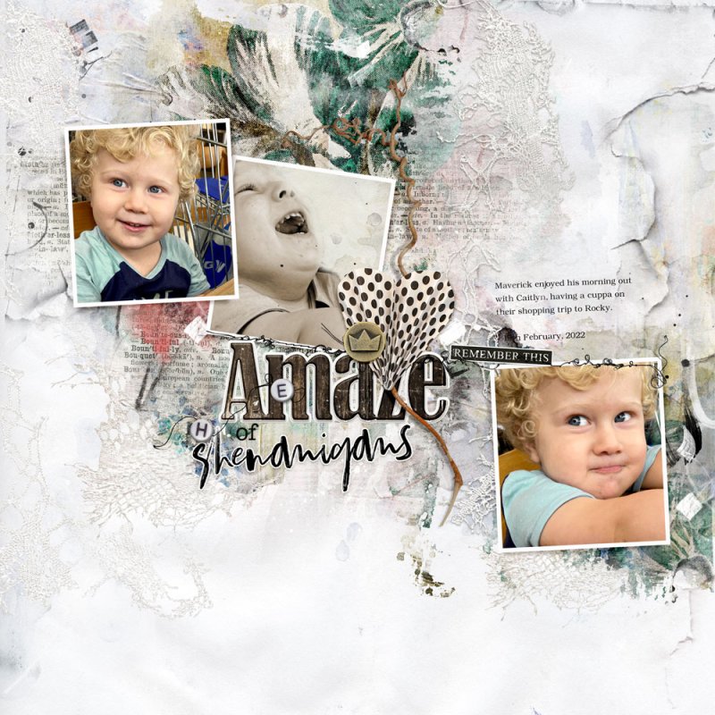
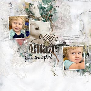
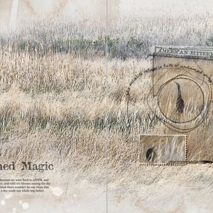
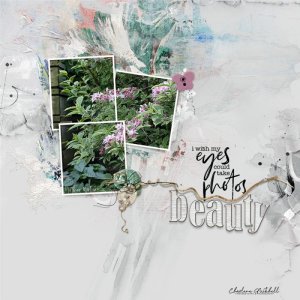
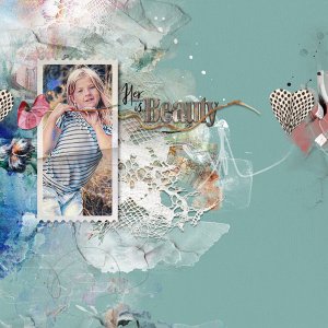
Process The Artsy Layered Template included in this Collection was opened and a Solid paper placed on top of the Background Layer. The colour was adjusted via Image>Adjustments>Hue and Saturation. Some of the template layers were turned off and others were moved or filled with colour to better support my layout. Images were clipped to the frame layers. One photo was desaturated to a light sepia and an accented edges filter was applied. An artsy paper was clipped behind the desaturated photo which was blended via a Layer Mask and Brushes. Transfers and WordTransfers were placed behind the frames and dimensional elements added on top of the frames. A little journaling completed the page.
- Designer(s) Used:
