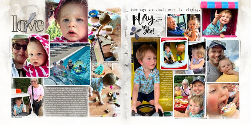
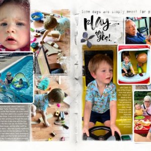
Documenting a recent visit from my son and grandkiddos using FotoInspired templates.
I tweaked the template a bit by elongating some of the fotomasks on the template and repositioning others. As always with my family pages, there's little inherent color coordination to speak of, so the papers in the Bravura Collection made a good neutral background—I used Artsy #2 as the base with Artsy #3 atop on screen blend mode. And then I built a visual triangle of gray/blue based on my son's shirt using the transfers and paper brushes in the Classic Collection.

