Oscraps
- Credits list
- Artplay Ikigai Collection
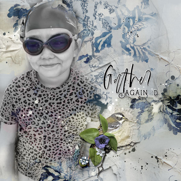
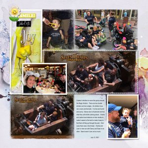
Process I chose an artsy paper for the foundation of my layout. I placed a desaturated version of my image onto my page and applied a darker colour blending mode to it before adding a colour version of the image and added a layer mask. Using brushes, I “hid” most of the image, only allowing the purple of the goggles to show through, applying a Color Blending mode to this layer. Transfers, artstrokes, overlays, splatters and brushes were placed on top of the photo layers applying various blending modes to some of the layers. Dimensional elements and wordart completed the page.
- Designer(s) Used:
