Oscraps
- Credits list
-
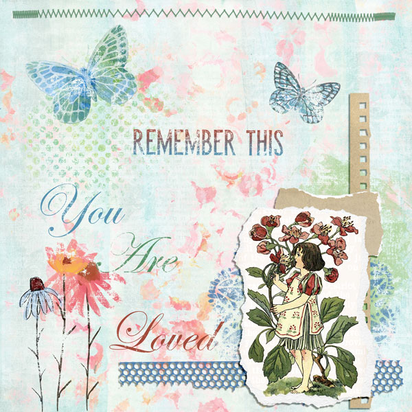
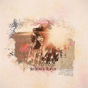
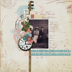
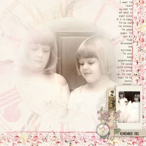
Credits: Summer-ish Take 2 Collection and July 2021 Challenge Prompt from Vicki Robinson Designs
Font is Edwardian Script ITC
I used a Gradient Overlay on the Remember This word art so that it would match the other colors in the layout. I also made use of the Underlying Layer slider on any layer that was not a paper element layer or stitches in order to give the page a more artsy look. I also used two papers for the background layer. The bottom layer is a green paper set to normal and the top paper layer is a pinkish paper with the blend mode set to Darker Color.
- Designer(s) Used:

