Oscraps
- Credits list
- **new** FotoInspired Templates—Pak 2S https://www.oscraps.com/shop/FotoInspired-Template-Pack-No.-2S.html
Take Flight Artplay Palette https://www.oscraps.com/shop/ArtPlay-Palette-Take-Flight.html
Uplift Word Art No 1 https://www.oscraps.com/shop/Uplift-WordART-Mix-No.-1.html
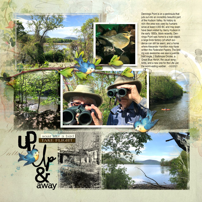
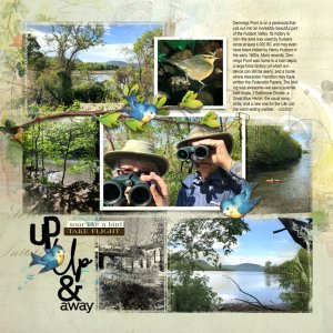
I removed three of the clipping masks to make this layout a little more spacious, then added photos, wordart, and journaling. The background is constructed of two artsy papers #1 over #4 on multiply mode, and I also added a third artsy paper (#3) also on multiply blend mode (reduced opacity) at the top of the layer stack. I did this to bring more of a deep, earthy feel to the papers, which, unaltered, are lovely but too pastel for this layout. I added transfers and overlays throughout the layer stack to augment this earthy feel. The little visual triangle of bluebirds was fun because we were hoping to see them in the fields we passed on our way to the trail (no luck). I finished up with a few other bits and bobs.
- Designer(s) Used:
