Oscraps
- Credits list
- Artplay Neige Collection
Beaded Threadz No.3
Process
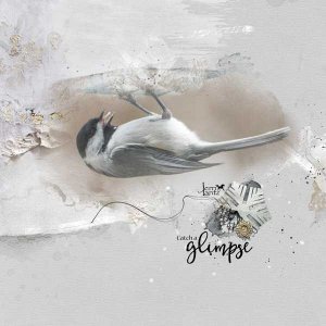
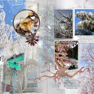
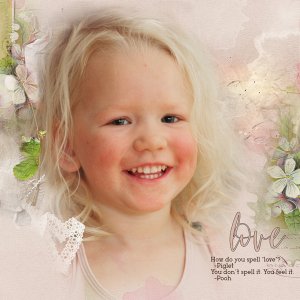
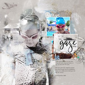
I used an artsy paper for the background of this layout before adding my large photo twice with Blending Modes Color Burn and Lighten, reducing the saturation of one layer. Overlays and paint layers were added to the background before a secondary photo was added to two frames and an artsy paper to the third. Transfers, lace, and paint were added on top of the large photo. Tape and BrushWork were added to the background before WordArt, labelled words and dimensional elements completed the page.
- Designer(s) Used:

