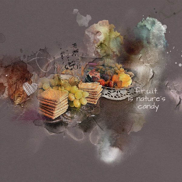
Process: I started with a solid paper from ArtPlay Palette Lost. I added two transfers from ArtsyTransfers Lost and the clipped the photo to a white paint layer. I duplicated the photo and the blending mode was set to Multiply. Then an adjustment layer for Levels to brighten it up a bit. A flower from ArtPlay MiniPalette Cherish was set to blending mode Color Burn and placed over the fruits in the middle to give more contrast. Then I added paints and brushes from ArtPlay Palette Lost and recolored the brushes into colors already found on the layout. The stitched heart comes from UrbanStitchez Hearts No 3 and was recolored into white and the doily from ArtPlay MiniPalette Cherish. I finishe the layout with a paint from from WhitePaint No. 1 which was placed over a brush along the right side.
I agree with Nancy. The dark background almost makes it look like a painting from the Baroque period. https://www.google.com/search?q=baroque+fruit+painting
trs belle cration artistique Ulla May, une belle nature morte aux lments bien organiss, trs beau travail de couleurs et de lumire,
et la petite touche en plus, cela donne bien envie d'y goter !!!
This site uses cookies to help personalise content, tailor your experience and to keep you logged in if you register.
By continuing to use this site, you are consenting to our use of cookies.