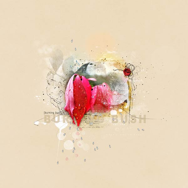
The burning bush in my back yard gives me a beautiful show every Autumn and this year I caught the leaves with raindrops. This layout is an exercise for Annas WordART Class using the balance and proximity approach.
ArtPlay Palette Harvest
AnnaRelease4October2013 On Sale
Autumn WordART Mix No. 1
AutumnWordARTMixNo.1
MultiMedia Rain No. 1
MultiMediaRainNo.1
ButtonThreadz No. 2
ButtonThreadzNo.2
ArtsyStains No. 2
ArtsyStainsNo.2
Bokeh No. 2
bokehNo.2
Fall WordART Overlay Free
FallWordARTOverlayFree
Photo: Mine
Font: Arial Black and Arial Narrow
Process Notes: Opening my photo and extracting the leaves and putting them on their own layer and linking them together, I placed them on a new 12x12 canvas where I resized and clipped them to one of the brushes in the palette, resizing again until I was happy with the orientation. (Sometimes, I will used several different brushes from palettes and group them together to get the mask I want for the layout.) I duplicated the photo one more time and put it on Screen Mode at 100% opacity. These layers were placed on the solid paper 3 from the palette.
The extracted leaves were duplicated two more times using these blend modes: Normal/100% opacity, Pin Light/100% opacity and finally Overlay/49% opacity after I used the Poster Edges filter on that final layer.
From there I started building from underneath the photo layers, adding transfers, overlays from the palette. I also placed the free fall word art underneath, resizing, recoloring and turning down the opacity. I left the transfers and overlays at Normal blend mode except for one, which I put on Color Burn, giving it a yellowish color. I also used the textured photo mask underneath the photo and above the transfers, giving the blended photo a little more depth.
Bringing in the psd MM Rain, I placed layers underneath and over the photo, adjusting the positioning in the layers panel as I continued to build the layout. Using brushes from the palette, I layered those over the photo, recoloring a couple of them to white. Much of these layers are between the photo and the extraction. I brought in more word art, one of which was added under the extraction and another at the top of the transfers under the photo.
The button and threads were added in the corner, recoloring the button with a hue/saturation adjustment layer.
Now it was time for the title. I tried a script font over the photo surrounding the extraction, but that just wasnt lighting me up. I wanted something a little different from what I had done before. Using Arial Black, I typed out burning bush, resized and recolored it a little darker than the background paper, gave it a tiny bevel and emboss and drop shadow and placed it between the extraction and photo. I also turned down the opacity to 65% so the scribbles and word art showed through. I typed out the name again with Arial Narrow and much smaller and put it above the left side of the large title.
For the finishing touch I used the psd Bokeh, resizing and positioning to give the piece a little more depth. And there you have it!