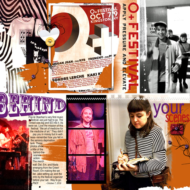
A page documenting my daughter's band's first music festivalThe international O+ Festivalfrom behind the scenes
Products:
Fotoblendz Layered Template #13 (retired)
Framed Masks 1_3 http://www.oscraps.com/shop/FramedMasks-No.-1.html
Original Fotoblendz 12_3 http://www.oscraps.com/shop/Original-FotoBlendz-No.-12.html
Urban Threadz No. 12 http://www.oscraps.com/shop/UrbanThreadz-No.-12.html
Buttons: Cosmopolis Artplay Palette (recolored) http://www.oscraps.com/shop/ArtPlay-Palette-Cosmopolis.html , Autumn Romance http://www.oscraps.com/shop/ArtPlay-Palette-Autumn-Romance.html , Memorable Artplay Palette http://www.oscraps.com/shop/ArtPlay-Palette-Memorable.html
Heart: Crazy Life Artplay Palette http://www.oscraps.com/shop/ArtPlay-Palette-Crazy-Life.html
Process with PSE14:
I chose a template to begin with because I had a whole bunch of photos and I needed some structure. (The Fotoinspired Templates would have been great for this, too.) My alterations to the template were few, consisting of adding a Framed Mask to contain the Festival poster and a Fotoblendz to hold the photo of my daughter preparing the band's set list.
Most of the time on this layout was spent on the wordART, trying to shoehorn a lot of words into a busy layout while still maintaining readability. I used the principles of proximity. alignment, and color from Anna's recent WordART class, but I also pushed myself to add different fonts. I also used the warp text tool, adding a little bit of fisheye with a -36 horizon distortion, Anna's philosophy on fonts being like blending modes (you never know what it's going to look like until you see it).
I finished up this layout by recoloring the paint layers in the template. I chose the brown color because I wanted to disguise the brown wall my daughter is next to. I also added a few elements for dimension.
PS: I really like how the stripes on the kids' shirts wound up matching the wallpaper at the venue. It's those little things....