Oscraps


Aug-Challenge-white-space.jpg
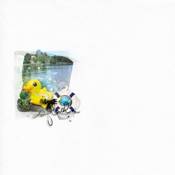
I struggle with white space and so I thought lets try and really stretch! I attempted to blend and overlay and play with In the Water Value Pack. I created my layout covering 90% of the page, then reduced it down too be little. Still feels wrong to leave so much space ")
- Designer(s) Used:
- Photo(s) Credit (REQUIRED field beginning Feb 1, 2025)
- Photo is mine.