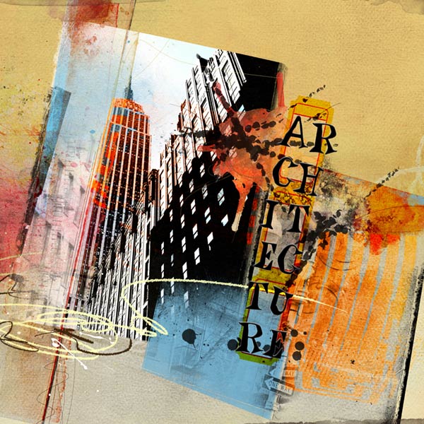
I love the idea of the ARTChallenge and wanted to get in on it. What I saw in the art was big city architecture and the angle reminded me of how tall buildings look when you gaze up at them from the sidewalk. The other thing I loved about the art was the colors and thats why I chose ArtPlay Palette Bask.
ArtPlay Palette Bask
ArtPlayPaletteBask
ArtPlay Bask BrushSet
ArtPlayBaskBrushSet
ArchiTextures No. 2
ArtchiTexturesNo.2
Artsy FotoBlendz No. 1
ArtsyFotoBlendzNo.1
DifferentStrokes No. 5 (Retired)
DifferentStrokes No. 11
DifferentStrokesNo.11
Photo: MorgueFile
Font: CK Blues
Process Notes: I used four papers from the palette as the foundation rotating a couple to get the angle and blending them. Using a layer mask, I brushed out parts I didnt want. I love the colors of APP Bask and thought blue would be a good compliment to those colors.
I brought in a mask from the Bask BrushSet and clipped the photo to it after putting a Threshold adjustment to it to bring out the lines of the architecture. On the left side over the photo I placed a architecture brush, reducing the opacity. I did the same on the right side of the photo after placing another mask from the APP and recoloring the mask to blue. Then I added a third architecture brush overlapping a little.
Over the Empire State building I placed the fotoblendz, recoloring to orange, duplicating it and both layers are on Overlay blend mode. I duplicated it one more time and placed it next to the blue at the bottom right and rotated it. It is also on Overlay blend mode.
I continued the angle to the right edge of the page using brushes to create sharp lines leading to the edge. Many of them are blended with Color Burn. Using more brushes throughout the page to give a little texture/interest, tucking them in here and there.
Using overlays to soften the page a bit, I placed the sun and scribbles from the palette.
Creating the title I kept in mind tall buildings, then thinking of windows, placed the ticket frame underneath blending it to Color Burn. On the title I used a bit of a bevel and emboss, outer glow and drop shadow. And that finished the page.